“First of the Modern Temples,” Ensign, July 1977, 6
Special Issue: The Arts
First of the Modern Temples
The Alberta Temple, boldly modern for 1912, is one of the great architectural creations of the Church.
Of all the art forms employed to express Latter-day Saint ideals in the first hundred years of our history, none involved so many people directly as the architecture of the Church. From the early days of the Restoration, Mormon communities dedicated their energies, abilities, and means to the erection of meetinghouses, schools, tabernacles, Church offices, and other structures. In spite of poverty, geographical isolation, and a hostile environment, not even the early pioneers were long satisfied with merely utilitarian shelters for worship. Their religious buildings became symbols of their dedication to the gospel as well as their appreciation for beautiful things and fine workmanship.
In their style of architecture, most nineteenth-century Mormon buildings drew their design ideas from three sources: the tradition of simple early American meetinghouses, particularly those in New England and the Middle Atlantic States; the Greek Revival with its careful proportions and classical details; and the Gothic Revival with its buttressed walls, pointed windows, and strong vertical lines. The Greek and Gothic Revivals became popular in America and England during the first half of the nineteenth century and remained dominant in the Mormon community throughout the remainder of the century, even after more elaborate and exotic styles had become fashionable elsewhere.
In Utah, these styles were usually intermixed and simplified somewhat. Built of either adobe or bricks made of local clay, or stone quarried nearby, these early structures had a natural relationship with the colors and textures of the surrounding landscape. Located prominently in towns based on Joseph Smith’s plan for the City of Zion with broad tree-lined streets and square blocks, these buildings began to evolve into a distinctive architectural tradition.
The highest expression of this architectural tradition can be seen in the beautiful Utah temples erected in St. George, Logan, Manti, and Salt Lake City, all begun under the direction of President Brigham Young. These four buildings shared certain characteristics: strongly fortified and buttressed walls, impressive towers, and dramatic natural settings. Each of them represented the offering of the best in design and craftsmanship that the pioneer generation had to give.
By the time of the completion of the Salt Lake Temple in 1893, the architecture of the Church had begun to change. Utah was less isolated from the rest of the nation, and the influence of new architectural styles began to appear in Latter-day Saint buildings. Chapels were built with Russian onion-shaped domes, Italian Tuscan towers, Spanish Baroque gables, and windows of every shape and size. Although some of these buildings were as well designed as those of earlier times, they reflected a decline in popularity of the old styles and an increased willingness to experiment with new ideas.
By the first decade of this century, the Church found itself in a period of relative peace and prosperity. After four decades of governmental harassment and financial difficulties, the Church had finally achieved a measure of renewed confidence and financial stability. A new generation of Saints had taken their places as leaders of the Church, men who combined loyalty to their heritage with an awareness of the discoveries and challenges of the new age. It was in this situation that Joseph F. Smith, the first second-generation President of the Church, announced plans to build a temple in Canada in 1912. Architecturally, however, the temple posed a problem: which of all the new styles of architecture would be proper for such an important building in this century?
Faced with this question, the First Presidency decided to seek the advice of the most talented men available—they invited all of the prominent Latter-day Saint architects of the day to participate in an anonymous competition for the design of the temple. Seven architectural firms responded by submitting drawings, which were placed on public display before the selection was made. Most of the proposals looked to the past for their inspiration; they had towers and pinnacles resembling those on the Salt Lake Temple. However, the First Presidency passed over these traditional schemes to choose a daringly modern design. When the winning entry was announced on 1 January 1913, it was learned that the winners were Hyrum Pope and Harold Burton, two young architects who had been in business less than three years. Pope, the engineer and business manager of the firm, was a capable and ambitious German immigrant of thirty-two; Burton, the junior partner and designer, was only twenty-five years old. This commission launched their prolific and creative careers, which were to include such other distinguished buildings as the Hawaii Temple, the Montpelier and Blackfoot tabernacles in Idaho, the Wilshire Ward in Los Angeles, the Honolulu Tabernacle, and the Oakland Temple.
In style, the winning design for the temple showed some similarities to the work of the great modern American architect Frank Lloyd Wright. Working in Chicago, Wright had designed residences and public buildings that were bold in form, original in their geometric decorative details, and carefully blended with their natural surroundings. Pope and Burton were among Wright’s earliest admirers in the Western United States. There was also a vague resemblance in the temple to the pre-Columbian ruins of Mexico and Central America, which Burton greatly admired. Combining these influences, the temple design was unquestionably in the forefront of American architecture of the period.
To say that the temple was influenced by the work of other architects does not imply that it was lacking in originality. Indeed, Pope’s and Burton’s great achievement was their ability to use the newest and best design ideas in a way that was particularly appropriate for a Latter-day Saint temple. Since the new temple was to have neither a large assembly room nor towers like previous temples, a completely new arrangement had to be worked out. Burton had a difficult and frustrating time with this part of the design until a very simple and logical floor plan occurred to him. As he envisioned them, the four ordinance rooms would be arranged around the center of the building like the spokes of a wheel, each room facing one of the cardinal directions. The celestial room would be placed in the center at the very top of the building, with the baptistry directly below. This arrangement placed the rooms in a practical and symbolically appropriate relationship to each other. As a person moved through the ordinance rooms he followed a circular path, finally coming through into the center in the celestial room. Each room was also a few steps higher than the one before, with the celestial room and the adjacent sealing rooms being the highest of all. Thus, the architectural arrangement expressed the same idea of progression that is found in the temple ceremony itself.
The design of the outside of the building was equally satisfying. The unity of interior and exterior, a basic principle of modern architecture, was evident in the fact that the major rooms inside were the most prominent features outside as well. The ordinance rooms formed the major wings of the building, and the celestial room projected above them all in the center. Smaller rooms and stairways formed minor wings projecting diagonally between the major ones. The pyramid-shaped silhouette was particularly well suited to the temple’s site on a low hill in the midst of a broad prairie, since the temple appeared equally strong, well proportioned, and handsome from all angles. The retaining wall around its base created a platform for the building in the vast landscape, and the symmetrical design turned its back on no one. Although completely modern in style, the new temple possessed the same feeling of permanence, solidity, and dignity that had characterized all of the earlier temples.
As Harold Burton chose the colors and materials for the interiors of the building, he elaborated and enriched his original idea of progression. Not only would each room be higher in elevation than the one before, but each would also be richer in its materials and decoration. The simplest of the major rooms was the chapel, which had plain walls painted silver-gray with natural oak moldings. Next was the creation room, which was paneled in oak with some inlays of maple and ebony in simple geometric patterns. The woodwork for the garden room was birdseye maple, richer in color and grain than oak, and enriched with both inlay and delicate moldings. The world room was richer yet, with its paneling of South American walnut carved in shallow grooves to expose the colors in its rich grain. Larger panels of African mahogany inlaid with other woods covered most of the walls in the terrestrial room. Finally, the climax was reached in the celestial room where a large expanse of African mahogany was set above a wainscot of polished Utah onyx on a marble base. The wood panels were inlaid with rosewood, maple, ebony, and tulip in delicate patterns showing remarkable craftsmanship. The three smaller sealing. rooms were equally beautiful, paneled in American and Circassian walnut, and cross-grained African mahogany. Thus, the progression in decoration began with small panels of simply grained, light-colored woods and ended with very large and elaborate panels of the richest woods. The carpets, drapes, and upholstery fabrics were carefully selected to blend with the wood in each room.
Great care was also taken in the selection of harmonious furnishings for the temple. When the Church leaders expressed their desire to avoid unnecessary costs, the architects volunteered to design all of the special furnishings for a very low fee in order to ensure their compatibility with the architecture. All of these furnishings were made in Salt Lake City under the architects’ direction, then shipped unassembled to Cardston, Alberta, where they were finished to match the architectural woodwork. For the celestial room, Burton designed tables, chairs, and sofas with ornamental carving to match the details of the woodwork around the temple veils. Unusual light fixtures, including a particularly handsome one in the celestial room, were also carefully selected by the architects. Leaded windows, each one composed of 144 small panes of glass in various colors and arranged in modern geometric patterns, added further to the richness of the room. Together with the stenciled ornament on the ceiling and the decorative grillworks set in the large arches on the four walls, these furnishings created a subtle harmony of colors and textures suggestive of the harmony and peace of the celestial world.
Latter-day Saint artists spanning three generations worked side by side on the murals of the temple. LeConte Stewart, in his late twenties, supervised the decorative work and painted the murals in the creation room. These murals were painted with small daubs of color, much like the pointillist style of some of the French impressionists. In the next room was Lee Greene Richards, a man in his early forties, who had been one of LeConte Stewart’s teachers. His garden room murals recalled some elements of art nouveau, including a sinuously curved tree and a graceful peacock. A. B. Wright, one of Richards’s contemporaries, was also at work on smaller paintings in the chapel and terrestrial rooms. Meanwhile, Edwin Evans, a well-established artist in his sixties, who had taught both Richards and Wright, painted scenes of the Alberta countryside in the world room. Torlief Knaphus, a Norwegian convert and sculptor, carved a bas-relief for the front of the building and the oxen for the baptismal font. These oxen have been recast in recent years and used in several of the newer temples.
Although ground was broken for the temple in 1913, the severity of the Canadian winters, the remote location, and the interruption of World War I extended the time required for completion of the structure to a full decade. During this period, other temples in Hawaii and Arizona were begun. Both of these beautiful buildings were influenced by the design of the Alberta Temple. More than twenty chapels and tabernacles were also built in a style similar to that of the Alberta Temple during this same decade. These remarkably modern buildings were found in locations as widely separated as Salt Lake City, Utah; Denver, Colorado; Portland, Oregon; Brooklyn, New York; and Melbourne, Australia. Three of the finest buildings in this style that are still in use by the Church are the Parowan Third Ward and the Ogden Deaf Branch, both in Utah, and the Montpelier Tabernacle in Idaho. Together, these many structures constituted one of the most remarkable collections of early modern buildings anywhere.
Dedicated by President Heber J. Grant in August 1923, the Alberta Temple is now in its fifty-fourth year. Some additions and changes have been made to the building, but most of its unique character has been preserved both on the exterior and the interior. All of the paintings and much of the beautiful woodwork, harmonious color schemes, and elegant furnishings remain in their original condition. It is to the credit of Canadian Church leaders that such loving attention has been given to preserve the temple’s artistic integrity.
Viewing the temple across the prairies of southern Alberta today, one is still struck by the beauty and the appropriateness of its design. It is a fitting memorial to the faithfulness of the Canadian Saints, the vision of Church leaders, the skill of three generations of artists, and the genius of two young architects. After a half century of service it remains one of the finest architectural achievements in the Church.
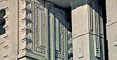
Detail of geometric carvings around the tops of the windows.

Looking northeast toward Old Chief Mountain, whose rugged lines seem to echo those of the temple, the Alberta Temple is constructed in native white granite.
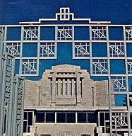
Steel gates mirror the geometric motifs and shape of the temple itself.

Jesus and the Woman at the Well, a bas-relief by Torlief Knaphus, is cast in concrete carefully matched to the granite. Originally a pool reflected it.
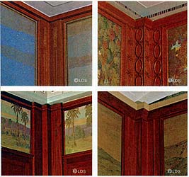
Clockwise: Oak with inlay in the creation room, birds-eye maple in the garden room, South American walnut in the world room, African mahogany in the terrestrial room. (Copyright by Corporation of the President, The Church of Jesus Christ of Latter-day Saints.)
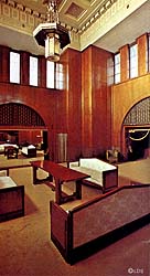
The celestial room wainscot is Utah onyx on a marble base; the African mahogany panels feature exquisite inlays of rosewood, maple, ebony, and tulip woods. The couch, originally upholstered in dark red, and the table were designed by the architect to match the temple’s style. Each leaded window contains 144 small panes in geometric designs, and each wall is set off by the decorative grillwork over its arch. (Copyright by Corporation of the President, The Church of Jesus Christ of Latter-day Saints.)
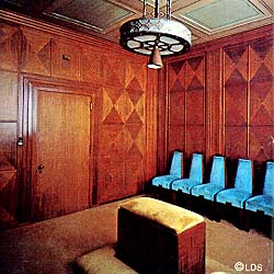
The sealing rooms are richly paneled, this one in cross-grained mahogany triangles forming two-foot squares. The chairs were designed for this room. (Copyright by Corporation of the President, The Church of Jesus Christ of Latter-day Saints.)
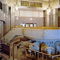
The Norwegian-born sculptor Torlief Knaphus carved the cast-concrete oxen to support the tile-lined concrete font; its ornamentation recalls the triangular carvings on the outside of the building. The mural, Adam Offering Sacrifice, is by A. B. Wright. (Copyright by Corporation of the President, The Church of Jesus Christ of Latter-day Saints.)
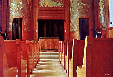
Natural light brightens the clear tones of the garden room. Details on the bench legs match the altar; the benches were assembled and stained in the room itself so that they would match the birds-eye paneling. (Copyright by Corporation of the President, The Church of Jesus Christ of Latter-day Saints.)
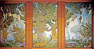
This garden room triptych by Lee Greene Richards uses impressionist techniques in its blue and purple shadows; his treatment of the foliage and peacocks were popular elements of art nouveau, a turn of the century movement. (Copyright by Corporation of the President, The Church of Jesus Christ of Latter-day Saints.)

Detail from A. B. Wright’s Baptism of Christ, one of four murals in the baptistry. (Copyright by Corporation of the President, The Church of Jesus Christ of Latter-day Saints.)

In the creation room, LeConte Stewart shows the earth swimming into focus in a series of paintings that become progressively less abstract and more defined, representative of the creative periods themselves. (Copyright by Corporation of the President, The Church of Jesus Christ of Latter-day Saints.)

A jaguar snarls above the dead impala in the world room. Edwin Evans and his assistant, Florence Christensen, used local scenes in their paintings for added impact. (Copyright by Corporation of the President, The Church of Jesus Christ of Latter-day Saints.)
Photography by Craig Law and Lonnie Lonczyna, Jr.